Thursday, April 12, 2012

The Game Industry

The industry. I'm a student so I want there. But how can I do that? During these two years in TAMK the need of trying to achieve something on my own gets stronger and stronger. I want a job, I want to prove employers that I'm a great worker and artist. Take me in!

This has nothing to do with the text! Ha!
First of all, everyone talks about networking. IGDA meetings, conferences, events.. Yeah, it's always good to know people and during the time in my school I've built up a growing network of fellow students, industry people and other specialists. Cool, now I can ask for help, tips, recommendations, feedback and company for a beer and of course giving all this back in return if someone is looking for it.
It's also good to have visibility to your work and achievements; LinkedIn, Facebook, Twitter. Make yourself visible to employers! Do stuff! Make games and art! 

Portfolio is really important for a game artist. This article in Gamasutra could give you some tips if you don't know where to start. Mine (linked in the right column) is still in a free server built on a template. It's easy, dirty and fast. I don't recommend to anyone but I'm just too busy and lazy to create a better one at the moment. That might just be a reason why I didn't get a summer job at the new Rovio office. On the other hand, I got an invite to another company's interview without even showing my portfolio at first. Strange!

I believe in my skills and art. If someone turns my application down, I won't be too sad about it. There are millions of chances around all the time. And one thing that I keep noticing in this field is that you have to do it again. Draw something, whatever it is, and you'll have to make it again. Something has to be changed all the time. I have an excellent example on this one to show later.
During this project I've had to accept the fact that whatever I do and am happy with might be turned down and changed into something which doesn't look good or make sense in my opinion. I just have to do that because it's not up to me to decide. The motivation might not be the highest at that point, at least after the fifth change, but I've noticed how it affects the workflow. When you recognize it, it's easier to handle.

Just some thoughts, not directly about the project but something that I've been thinking about during it.


Wednesday, March 28, 2012

User Interface

User interface graphics: not my personal favorites. Buttons, bars, panels, decorations.. Only if I could only do character design and all that fun stuff.
Disappointment.
The main thing is to keep the overall look of the game coherent. The different objects and elements should work in unison, nothing should look like out there. This is a play of shapes, sizes, colors, fonts and placing, where to put what. Seriously, this is hard. I have to admit I'm not really skilled in this area of design but since it's a part of my work in this project, I have to pay full attention to that thing, too. I'm not quite sure where to look for any tips, guides or tutorials for user interface design in games. Any ideas, leave in the comments or mail me, all help appreciated.
In this blog I have to talk a little about the gameplay and usability features, too. But no worries, graphics are still the main point. I'll introduce the screens of the game.
Start screen.
That's what we start with. This is what the player will see first. By the way, don't mind the name, it's just a placeholder. The icons are a little bit cleaner in the finalized version, but this is how it should look like in general. The buttons will turn a little darker as they are pressed to show that some interaction happens there. The scoreboard in the middle is supposed to be a list of names of other players playing the game. Icons should be fairly simple, turning on/off the music and/or the sound effects. Game center takes you to other games.
The colors of the buttons don't really fight with each other but they are quite boring. I have no clue what to do with them, really.. The main thing, the play button is visible and bigger than the others so that's a good thing.
I'm quite not sure about the decorations in the brown panels yet.. I have to take a look at them later.
Power-up screen.
Choosing power-ups comes after the start screen when the player taps the play button. In this screen the player chooses the power-ups. Power-up images are all placeholders for now. There are three power-ups the player is able to take for one round of the game.
There's a small description box under the three chosen power-ups which tells the player what that particular power-up is going to do in the game. I thought it would be clear to dim the other power-up icons when one of them is selected. This makes it clearer to understand which one of the power-ups is currently chosen for the description text.
In the bottom there's the list of power-ups (the row of turquoise dragons). The idea is that the user can swipe the row to see more options. It could be though that we implement only the amount of 5 power-ups to this demo version.
Game screen.
This is where the most important task happens, the play. Some of you might notice a huge change in this. Where are the cute dragons gone? Well, the blocks were fairly boring, so to say, and the dragons didn't really fit in there anyway. It looked boring and square. The whole idea of the game had to be changed. The dragons are not gone, though! I will explain the fruits later on.
We also changed the amount of the colors to 4 and they will start disappearing after 3 or more objects with the same color are next to each other.
The pink highlight depends on the color of the fruit that is about to be dropped. When the player slides the fingertip on the screen, the highlight follows. When released, the fruit drops to the desired place. It's also possible to tap on the wanted column and the fruit will drop. This wasn't in my opinion accurate enough, I kept dropping the fruit to the wrong place all the time which is frustrating in a fast-paced game where you're not allowed to make mistakes.
The background is way too bright. I'll have to make it a little bit darker and maybe blur it as well that the player doesn't get a headache from all these bright colors.
Pause screen.
The pause screen. I'm completely lost with this one, it looks terrible. The nice idea was to have a little window to the game (not too big, the player is not supposed to cheat by looking through!) which is also the "continue" button. It's easy to understand the triangle icon in the middle. I was just so done with the basic list of buttons "continue", "restart" and "quit". 
I seriously haven't done too much about this. Only the buttons are the same as in the other screens. But the background.. Well. I'll have to take a careful look to it that it would at least  look like something.
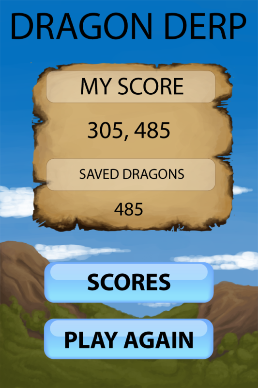
Score screen.
This screen has to be majorly changed. You don't count saved dragons anymore.. I have to see if that burned paper background I painted will ever work in this game. I tried to put it in many places but realized it's not a good idea. Here it could work but I can't convince myself about it just yet. I'll have to see if it works in unison with the other UI graphics.

So there's still a lot to do about these, some details there and there, maybe some color changes.. But I'm quite happy so far. The colors are not disturbingly bright (even though they are quite shiny bright). I still have to check out the fonts properly since I haven't paid attention to those at all yet. Hope this work in progress blog was helpful for something!

Thursday, March 15, 2012

Backgrounds

Some time ago I've been painting backgrounds for the game I'm working on. It was quite a nice process in amount and painting is somehow relaxing. You don't have to think too much, just let it go and soon you have something on the screen. I'm of course talking about digital painting now, even though traditional painting would also work in a game background. This time I won't go there, though.
Backgound sketch, grayscale.
So this is what I started with; a grayscale sketch painting of the thing I wanted. Since the theme is about dragons I thought it would be a good idea to have volcanoes in the background. I had a couple of photos as reference for color schemes and shapes. I'm still not sure if the lava is actually necessary but let's have it here for now.

The idea for the background (why it's so long) is that it's going to scroll down as the game goes forward. That way you have a feel of the progress, like digging deeper as you score more points. 
The final background.
This image is so far the final image. There was really not too much iteration in this one, it just came out nicely so I didn't see a reason to change it too much. The attention in this whole picture goes to the top where you have a lot of light and light colors. On the other hand, the "front" of it, the bottom, looks like it's in shadows. This works as a whole image but let's see if it works in the game. Still to be tested.


Also the background needs to be as simple as possible so that it doesn't disturb the player while playing. This means I will probably blur the image just a bit. That will create a feel this image is even further away.


The menu background.
As we needed a background image for the menu as well, I thought to keep the mountain/volcano theme. After painting the in-game background this was a lot easier and quicker to paint since I already hat got used to the flow.
In this image there's not really a clear source of light and everything looks kind of dark. I don't think it's a problem, though. It won't catch the player's attention from the menu and the items on it (not ready to be shown yet).


This week I've been working with the user interface layout and other stuff that belongs to that, like buttons and icons. I've had quite a struggle and notice that my motivation isn't as high as it was when painting the backgrounds. But I'll pull it off anyway and discuss the results later in this blog.


Thursday, March 01, 2012

About Character Iteration

During this week I've learned quite a lot. After I got some pretty strong comments on my graphics I had made, I had to think about a new strategy and it really helped me to go on. Iteration is indeed one of the most important words when developing games as well as graphics. Here's one small cycle of iteration in this particular project, of course from the graphics point of view.
First sketches
Let's start off with the first sketches I made. Naturally, I felt like taking the pencil in my hand and just put some ideas on the paper. These first sketches are quite okay in my opinion. The point is to show that the small and cute dragon-like character is trapped in this block. The characters are sad, the player should free them and they'll be happy! 
First digital versions
At this point I took one step back. I didn't iterate. I just took the sketches and made the digital version on them. At this point I got not so good comments about them. Also, when you try to make graphics for a game on the iPhone, you have to remember that the images will be small. That means you have to keep these images as simple as you can in order to make them understandable.
Here comes the point where you should start iterating the shape and the basic feel you want to show with the character. I had to learn it a bit harder way and I'm happy I got some rough comments even though it hurt. But that's the reality. It's better to get it now than later in the work life. Or basically better to get used to it.
Playing with silhouettes
I bet you can see the difference as clearly as I do. It looks much better already. These silhouettes were the solution for the problem of how to create a shape that looks like a sad little dragon. The eyes are the only bigger detail with of course some spikes and stuff that dragons can have. The eyes tell a lot about the feeling already.
And the winners
So the best ones were chosen (democratically, I asked for some opinions). Again, trusting my own skills is good but I still feel like I need some directions. Also the colors had to be tested and I like these ones. Usually the colors in these sort of games (mobile arcade) are simple red, green, blue and yellow. We thought it would be better to break this a little, why not have some other colors instead to distinguish from all the mass. The dragons look better in these colors, too, I think.
Pink

Purple

Turquoise
So far these are the final versions. They can still be changed but I am happy with these already. They are simple, not too many details which means they are understandable also in small sizes. The shape is clear (as you can see in the silhouettes) and it seems to work also in colors. The only thing that kind of bothers me is that they have no arms or anything so they look kind of like worms or something. Let's see if we decide to do something about it. 


The hardest thing in this phase was to confront myself as an artist and realize that I have to do more than just one version. I have to make it better. It's a skill to be able to receive all kinds of comments and critique and take it how it is, then try to develop better and better. I try to do that even if it's not always easy. I still need some confidence in creating all this by myself and coming up with everything without having to rely on others' opinions and suggestions. I'm here to learn!

Thursday, February 23, 2012

Problems

I'm facing this problem all over an over again: how to make decent-looking graphics? How to make them so glossy and eatable? My goal in this project is to learn to make it so awesome that I can proudly look back and see the progress. I want to learn something important in this project; I want to do a lot of work to make my graphics look good. Any tips and comments are welcomed. So, please, if you have any suggestions how to do make my graphics look better, I'd appreciate to hear your opinion.
Possible mascot for the game.
AppStore is full of really nice-looking games, like Fruit Ninja, Tiny Wings and Diamond Dash. I've played them and love the graphics. Those games, including many others, are going to influence my style a lot in this project.

Our project is going on for the second week and we have come up with a theme. The point in the game is to build 3 or more blocks of the same color. It's almost like tetris but the player drops only one block at a time. So the blocks have a tiny baby dragon trapped inside and the player's goal is to free as many as they can.

Some testing for the pixelz.
Dragon babies are trapped!
There was discussion about the images inside the block. They are too small compared to the amount of details they have and it doesn't look good on the iPhone screen. That's why I tried to take a lot of details off (compare the mascot picture above and the last one here). Also the pose of the character is hard to understand when you see only the small picture. It might not be so clear that it's trapped in there, even if in the bigger image it might be much clearer.
There will be 3-4 different colors and they probably won't be the standard red - yellow - blue - green. We want something a bit different.

My next steps will be iterating the character. I will also think about the background image which will stay darkish/natural colorish. That way it doesn't disturb the playing.

Sunday, February 19, 2012

The First Steps

Our team will start working from tomorrow on for real. We will meet hopefully quite often and have split our team in two; design & art and programming. We will of course work as a whole team but dividing into these two will help in the beginning, since the programmers are writing the basic code while I and our designer work on the visuals and mechanics.


I'm quite interested in how the game is going to look like. I have made a few mood boards to support the ideal themes for the game as well as a couple of sketchy backgrounds and color schemes. The theme is not set yet but we are currently working on it. Once it's set, we can start thinking about the icons and all other theme-related stuff. It might be that we still have to come up with several other ideas for the theme.
A quick sketch
 of the possible
background.
The background is going to scroll down once the player makes progress in the game. One round takes 60sec and I thought 3 times screen height is enough. That will be tested later on.
I'm going to emphasize on testing in this project because in my last project there was too less testing. The game has to be fun and easy to understand.

My goals are to make decent-looking graphics and learn to use Illustrator (vectors in amount) well in this project.

At the Beginning

Hey. I'm starting this new blog about a game development project that is supposed to last about 4 months. My role is to be the graphics artist so I'm going to emphasis on that part in the blog as well.


The series of posts will in the end basically describe the process of a mobile game project. I won't reveal the project partner's name and all the specific details unless they want so. I bring this case to the internet because I want to open the mystic process of game development for everyone.

I'm myself still pretty much a noob in this field but I'm highly active and doing a lot to accomplish something awesome.

So. I hope you get some valuable information in here once I've got more to say. Also comments are welcomed, please share if you think how something should've done in your opinion.


Thanks. :)