
 |
| Disappointment. |
In this blog I have to talk a little about the gameplay and usability features, too. But no worries, graphics are still the main point. I'll introduce the screens of the game.
 |
| Start screen. |
The colors of the buttons don't really fight with each other but they are quite boring. I have no clue what to do with them, really.. The main thing, the play button is visible and bigger than the others so that's a good thing.
I'm quite not sure about the decorations in the brown panels yet.. I have to take a look at them later.
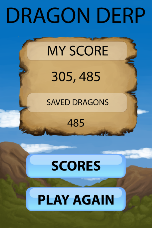
This screen has to be majorly changed. You don't count saved dragons anymore.. I have to see if that burned paper background I painted will ever work in this game. I tried to put it in many places but realized it's not a good idea. Here it could work but I can't convince myself about it just yet. I'll have to see if it works in unison with the other UI graphics.
 |
| Power-up screen. |
Choosing power-ups comes after the start screen when the player taps the play button. In this screen the player chooses the power-ups. Power-up images are all placeholders for now. There are three power-ups the player is able to take for one round of the game.
There's a small description box under the three chosen power-ups which tells the player what that particular power-up is going to do in the game. I thought it would be clear to dim the other power-up icons when one of them is selected. This makes it clearer to understand which one of the power-ups is currently chosen for the description text.
In the bottom there's the list of power-ups (the row of turquoise dragons). The idea is that the user can swipe the row to see more options. It could be though that we implement only the amount of 5 power-ups to this demo version.
 |
| Game screen. |
This is where the most important task happens, the play. Some of you might notice a huge change in this. Where are the cute dragons gone? Well, the blocks were fairly boring, so to say, and the dragons didn't really fit in there anyway. It looked boring and square. The whole idea of the game had to be changed. The dragons are not gone, though! I will explain the fruits later on.
We also changed the amount of the colors to 4 and they will start disappearing after 3 or more objects with the same color are next to each other.
The pink highlight depends on the color of the fruit that is about to be dropped. When the player slides the fingertip on the screen, the highlight follows. When released, the fruit drops to the desired place. It's also possible to tap on the wanted column and the fruit will drop. This wasn't in my opinion accurate enough, I kept dropping the fruit to the wrong place all the time which is frustrating in a fast-paced game where you're not allowed to make mistakes.
The background is way too bright. I'll have to make it a little bit darker and maybe blur it as well that the player doesn't get a headache from all these bright colors.
 |
| Pause screen. |
The pause screen. I'm completely lost with this one, it looks terrible. The nice idea was to have a little window to the game (not too big, the player is not supposed to cheat by looking through!) which is also the "continue" button. It's easy to understand the triangle icon in the middle. I was just so done with the basic list of buttons "continue", "restart" and "quit".
I seriously haven't done too much about this. Only the buttons are the same as in the other screens. But the background.. Well. I'll have to take a careful look to it that it would at least look like something.
 |
| Score screen. |
So there's still a lot to do about these, some details there and there, maybe some color changes.. But I'm quite happy so far. The colors are not disturbingly bright (even though they are quite shiny bright). I still have to check out the fonts properly since I haven't paid attention to those at all yet. Hope this work in progress blog was helpful for something!
The success of a business depends on how appealing and user friendly the interface of a website is.
ReplyDeleteUser Interface Design